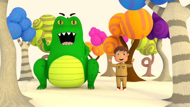
I have created and rendered two different pose shots to show the scale of the two characters and the outside environment. When actually creating the animation I will use stand in's for the trees to create a jungle. I also plan on using matte paintings to wrap around the scene to fully immerse the viewer into the environment.


Nice - thank you - just a nitpick - can you soften out the lighting/shadows on the boy's face in No 2 - he looks a bit sunburned! Also - I think you might want to consider the value in this 'bare set' approach (i.e. minus the matte painting) - I think it's looking rather striking and is worth exploring further. Something to think about too - is there a way you can introduce some drawn 2D elements into the environment that meshes with the 2D aesthetic of the character's mouths. It feels like a few 'harder line art' details elsewhere might pull both languages together - for example a few clean 'drawn' leaf shapes on the floor? I think it's worth investing a bit more time art-directing your environment (and improving your lighting still further) because it's beginning to look rather appealing - I love the move away from realism here - which is why I think the 'white space/imagination zone' is working so positively here.
ReplyDeleteOf course, I can sort the lighting and shadows no problem at all. I will be able to get these up later tonight, unfortunatly had to leave uni to get my car MoT’ed. In regards to the white space, do you think this could work for the final animation with the scenes that take place within Juniors imagination, or just for the promo shots? For the small aesthetics I was thinking this myself, I was considering making a few leaves and bushes to fill the scene around the ground level more. I’ll now go ahead and do this.
DeleteSo I think the 'white space' is going to work for Junior's imagination really nicely - it keeps everything very clean and book-ish. I think your lighting is a bit yellow here and could get a bit 'cleaner' - it doesn't want to go too polar and icy, but it's a bit 'nicotine' here if you know what I mean?
ReplyDelete