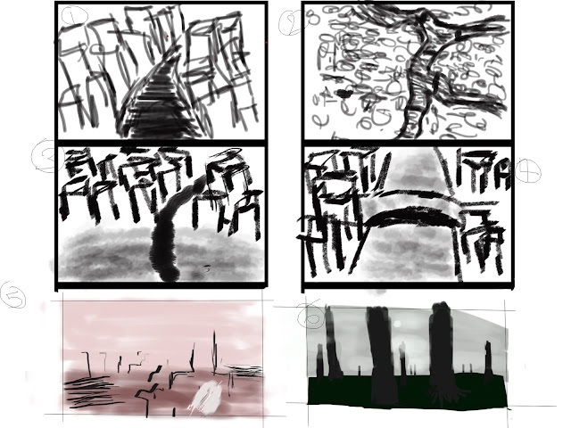
These are my first 6 thumbnails for the invisible cities project. Thumbnails 1-4 are of Anastasia, thumbnail 5 is of Armilla and 6 of Baucis. I'm not happy with my thumbnails. I have found it difficult trying to portray the idea I have of the cities in the thumbnails. I think this is due to a lack of my drawing skills and I have also found getting used to the graphics tablet within Photoshop fairly difficult.
With the thumbnails I tried to do the first four as simple quick black and white sketches, but from is it made all of the buildings appear as towers which is not how I imagined it. I then decided to try and to move into colour to see if that would help me convey my ideas clearer. Unfortunately with this I found myself trying to focus on the colours too much and spent most of my time worrying about that. I am going to keep working on my drawing skills and Photoshop skills and will be drawing thumbnails every day.

however... thumbnail No 6 is really moody, cinematic and bold, Ian - like it! Simple - but powerful. Can I suggest that, as you draw and think about drawing, you ensure you're referring to 'real world' reference - so for example, looking at the shapes and proportions of existing temples/buildings/staircases/pillars etc. etc. I don't think your issue here is one of drawing (nothing wrong with your mark-making, Ian) I think the issue if your knowledge of what you're drawing. Maybe think in a more 'kit-bashing' way - i.e. taking little bits of 'real word' reference, and drawing on top of them/combining them. Think laterally too - you don't just have to look at images of cities for your reference - think about 'structures' in the broadest sense - so the structures that animals build (nests and burrows), look at microscopic structures (salt crystals look amazing under an electron microscope) and be sure to keep your eye on all the Invisible City themed animations and short films on the Group Blog (which I hope you're following avidly!). In short, the reason why your currently struggling and disliking what is generic about your thumbnails is NOT some absence of potential in terms of drawing, but rather a deficit of actual information to shape your imagination more effectively. You need to look at more stuff and have more ideas before you start drawing again - and then, push some of that new knowledge about structures and buildings etc through your next set of drawings. And take confidence from thumbnail 6 - it's filmic! :)
ReplyDeleteOh - and just a bit of housekeeping - your blog banner should read Ian Garling / Ba Hons Computer Animation Arts / UCA Rochester
ReplyDeleteI agree with Phil here, I got stuck making boring houses for my first project because I didn't expand my way of thinking about a city. Explore things that aren't buildings and make them structural, you can find inspiration in anything. Don't worry too much about how the thumbnails look, just be expressive and don't get stuck drawing the same old block buildings.
ReplyDelete